ShopDreamUp AI ArtDreamUp
Deviation Actions
Suggested Deviants


Suggested Collections


Description
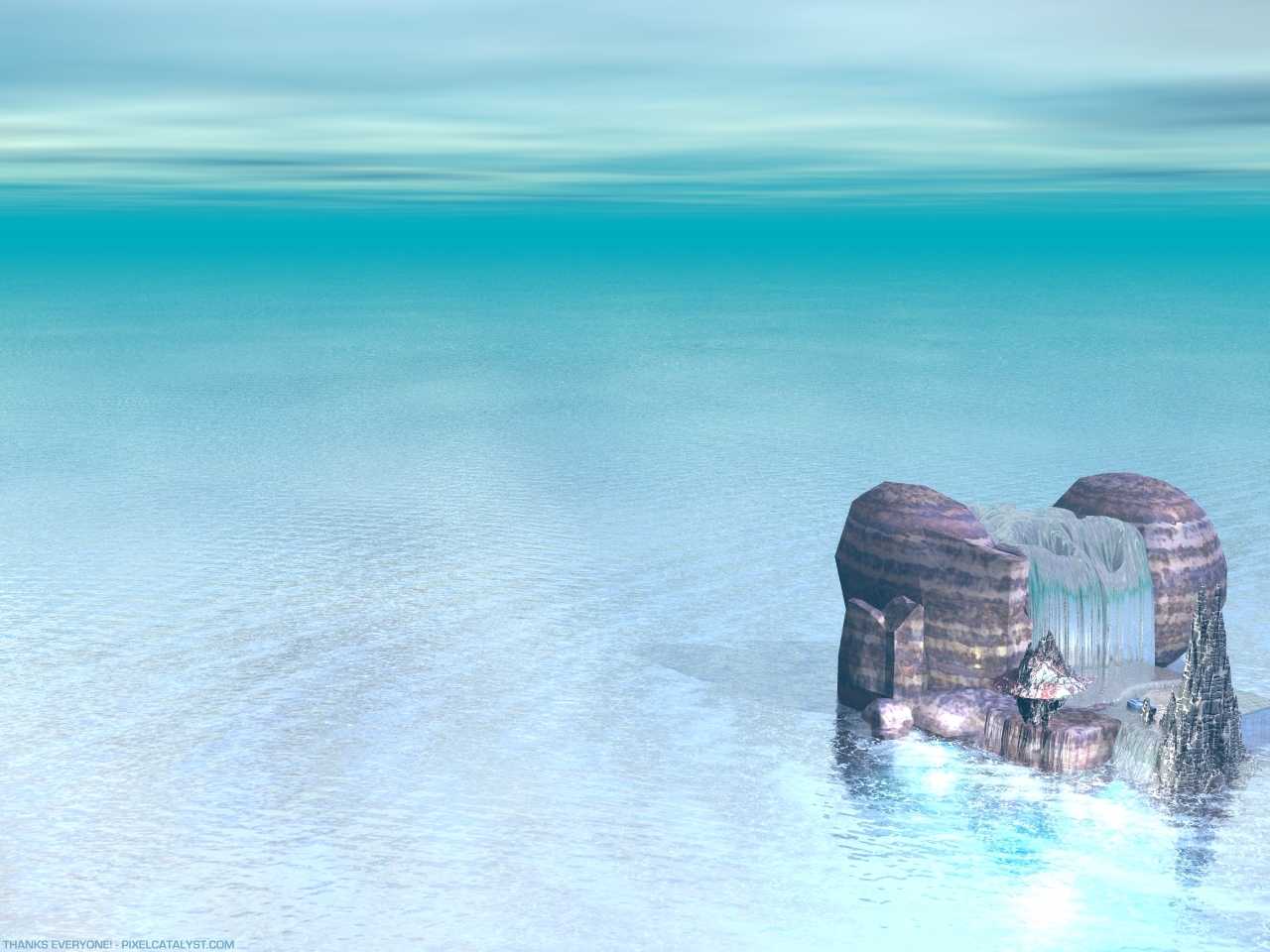
before there was pixelcatalyst.com... there was
pixelworkz first. (more info about this thing in my
site teehee!)
anywayz... pixelworkz will turn two this 20th of may
and i decided to create a sort of thank-you wallpaper
for everyone who visited the site... and inspired me
to keep goin'...
this is one of them... a re-rendered version of entrance wall but in a different farther camera angle... i was doing more 3D stuffs then (experimenting with bryce) before i stumbled upon
looroll.com and started doing 2D.
along with this wall i have uploaded the 1280 version of iconosphere in my site ([link] + the green version of that anime remix 01 wall... if you have some time do check those walls in my site as well.
thanks... (Smile)")
nothing much fancy about this piece... but it looks
good on your desktop.
happy weekend everyone!
pixelworkz first. (more info about this thing in my
site teehee!)
anywayz... pixelworkz will turn two this 20th of may
and i decided to create a sort of thank-you wallpaper
for everyone who visited the site... and inspired me
to keep goin'...
this is one of them... a re-rendered version of entrance wall but in a different farther camera angle... i was doing more 3D stuffs then (experimenting with bryce) before i stumbled upon
looroll.com and started doing 2D.
along with this wall i have uploaded the 1280 version of iconosphere in my site ([link] + the green version of that anime remix 01 wall... if you have some time do check those walls in my site as well.
thanks...
nothing much fancy about this piece... but it looks
good on your desktop.
happy weekend everyone!
Image size
1280x960px 719.24 KB
© 2001 - 2024 pixelcatalyst
Comments18
Join the community to add your comment. Already a deviant? Log In
uuuuuuuuuuuuuuuu....................niceeeeee...............bluee...........